Key Takeaways:
- The single navigation update streamlines user experience within MachineMetrics' platform.
- Simplified navigation improves accessibility and productivity for users.
- Enhanced interface design makes it easier to manage and monitor machine data.
Changes to the MachineMetrics platform are coming August 5th.
Over the past year, MachineMetrics customers have had access to two platforms: our MM Production application, as well as our Health and Service applications. For some of our clients, accessing one or the other can be a challenge. This would include opening a new window, logging on a second time, and, to top it off, the inability to switch back-and-forth between each platform is an unintuitive, time-consuming and challenging experience.
Anytime a company announces changes to its products, it’s either a love or hate relationship, and there is rarely an in between. We’re excited to announce that we’re merging both of our MachineMetrics platforms into one seamless user experience. Quite frankly, it’s about darn time! We believe you will love it as much as we do.
Why did we make two platforms in the first place?
We initially launched our second platform with the aspiration that a very different customer type would use it. It turns out that was not quite the case, as we found that many of our existing customers started to use this platform. Merging these platforms together makes much more sense for all of our customers.
What will actually change?
The biggest change you’ll see is the addition of a main navigation in the top bar. This will allow you to navigate across both platforms, such that it will feel like it is one platform and not two. The reality is it will be two different platforms under the hood and we’ll slowly migrate everything into one platform and you’ll never notice.

You’ll also note that we have used “Machines” where we were using “Workcenters” in parts of the product. We weren’t being very consistent across our product and we felt the need to be more consistent at this. We realize that you might have a different naming convention at your company and we understand. However we needed to make a decision and remain consistent. It’s also very much in-line with our company name.
The more subtle changes will be in the dropdown navigation menus, though we hope most of these are intuitive and feel very similar to what you’ve been using all along.

What will live under each section?
The main sections of the MM product are Dashboard, Reports, Machines, Health, Settings, and Profile. Each section has a main intention that helps organize the parts of the product that are categorized there.
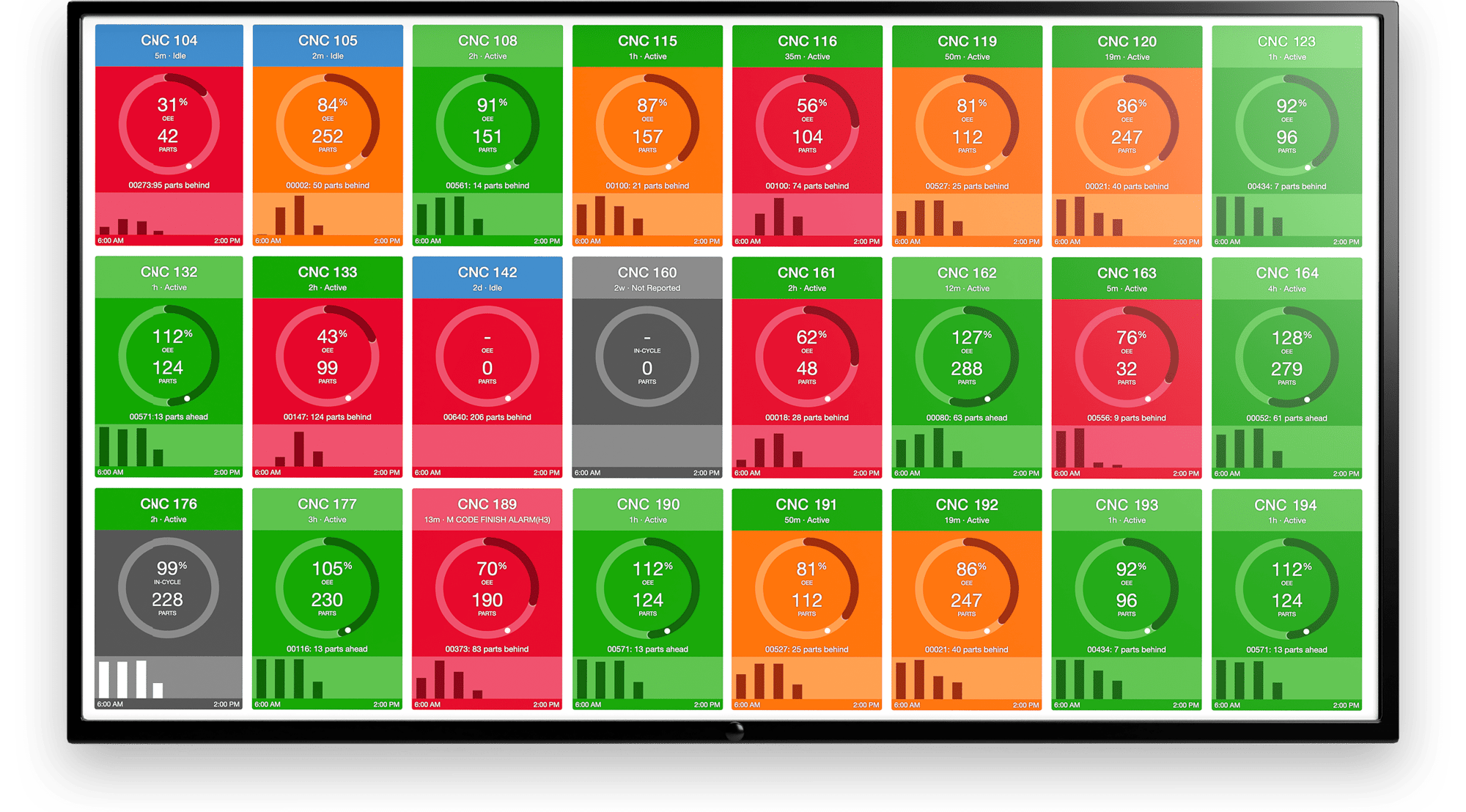
Under Dashboard, the main intent is “What’s happening right now?” with all your different dashboard views including a combined timeline view of all machine timelines.
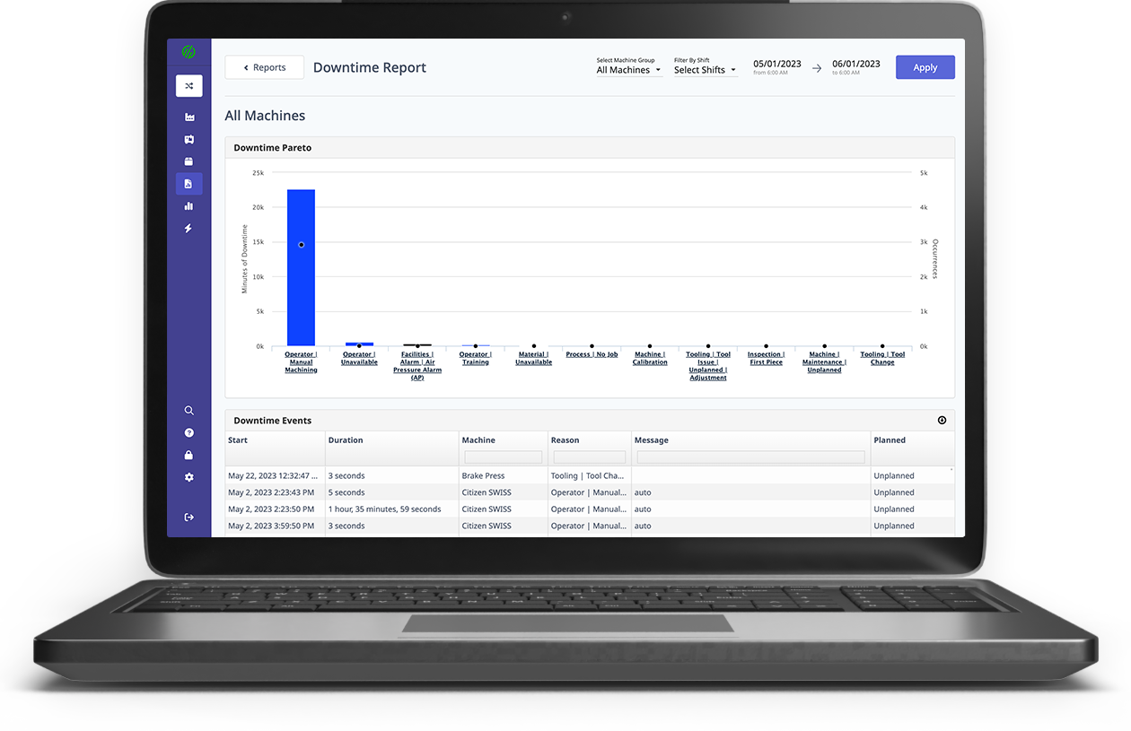
Reports will surface all aspects of the product with the intention: “tell me what happened.” You’ll be able to search in the past, whether it be last month, yesterday or last year across all machines or machine groups to find your production report, downtime report, setup history, and more.
Machines is where you will access all machine-specific pages with the intention “tell me everything about Machine ABC”. From the “Overview” page of an individual Machine, you will have the ability to dig into other areas such as diagnostics, cycle-analyzer, and machine timeline and find quick links to machine specific reports such as: Jobs report and Parts report, among others. You’ll still be able to view site-wide reports under the Reporting section.
Health is a part of the product that was mostly in our new platform, and this area intention is “all about the machine issues and maintenance” which will include Alarms, Monitors, Scheduled Maintenance and even Work Instructions.
Settings will house all things that are a setting or a configuration. The intention here is “get me set up and ready to go” and is where you’ll set up and manage all your jobs, add or manage users and operators,
You’ll also notice the user account under a profile icon. Here will be all the individual preferences you have for your own account: how you receive weekly summaries and notifications as well as manage and password changes or profile updates.
The Timeline: Standard and Detailed
For those who have used the Timeline features in App2, we have renamed it the Detailed View. This timeline allows you to add a number of different metrics to the timeline for viewing. Typically we found that when something happens to a machine a customer will use this view to diagnose what happened to learn more about the situation. We’ll discuss this in more detail at one of our webinars, as well as craft a post specifically about this functionality.

How did we get here?
We didn’t take this change lightly. We tested a number of variations with a number of customers over the past few months to ensure that it would be intuitive and not unfamiliar with how the product is currently structured. A big shout of thanks to all our customers who generously offered their time and feedback.
Why not just make one big change?
We love change and embrace it daily, though as continuous improvement junkies, we also realize that changing too much at once can cause panic and confusion, so we wanted to make changes that will set up future evolution and product enhancements while not breaking our customers' workflows today. We have plenty of plans and suggestions from our customers to make our product better and this sets the foundations for future product improvements.
Want to learn more?
Click the video below to see the recorded webinar with our VP of Product where shows an overview of the changes and answers questions from customers.
.png?width=1960&height=1300&name=01_comp_Downtime-%26-Quality_laptop%20(1).png)


.gif)

Comments